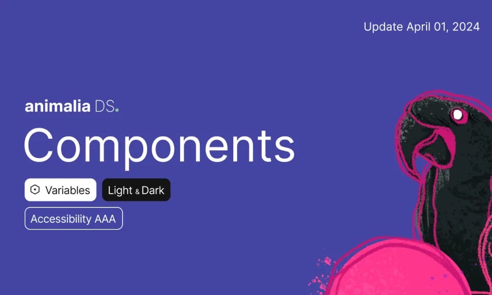
Animalia DS
umfassend Designsystem für consistent UI-Komponenten und guidelines in Animali apps.
Produktübersicht
Animalia DS (doc.animaliads.io) ist die offizielle Dokumentation für Animalias Design-System und bietet einen einheitlichen Rahmen zum Aufbau konsistenter, zugänglicher Nutzer-Oberflächen über Animali-Produkte und -Apps hinweg. Sie umfasst detaillierte Richtlinien, Komponenten-Bibliotheken und Best Practices, um Skalierbarkeit und Marken-Ausrichtung für Designer und Entwickler sicherzustellen. Komponenten-Bibliothek: Wiederverwendbare UI-Elemente wie Schaltflächen, Formulare, Navigation und Karten mit Varianten. Stil-Richtlinien: Spezifikationen für Farben, Typografie, Abstände, Icons und Motion. Barrierefreiheit: ARIA-konforme Komponenten und inklusive Design-Prinzipien. Integration: Figma-Dateien und Code-Snippets für schnelles Prototyping.
Am besten geeignet für
Style Guidelines: Specs für Farben, Typografie, Abstand, Symbole, und motion. Barrierefreiheit: ARIA-compliant Komponenten und inclusive gestalten principles. Integration: Figma files und Code snippets für rapid Prototyping.
Hauptfunktionen
- Komponentenbibliothek: Reusable UI elements wie buttons, forms, navigation, und cards mit variants.
- Style Guidelines: Specs für Farben, Typografie, Abstand, Symbole, und motion.
- Barrierefreiheit: ARIA-compliant Komponenten und inclusive gestalten principles.
- Integration: Figma files und Code snippets für rapid Prototyping.
Vorteile
- +Umfangreiche Symbolbibliothek
- +Farbpalettengenerierung
- +Barrierefreiheits-Kontrastprüfung
- +Fliese Animationsfähigkeiten
Nachteile
- -Einführung erfordert Teamabstimmung
- -Anpassung kann komplex sein
/// SPEZIFIKATIONEN
- Preis:Free
- Plattform:Browser
shadcn/ui
shadcn/UI ist ein einzigartig Sammlung von composable React UI-Komponenten, anbietend kopieren-und-einfügen Code jenes is highly anpassbar und seamlessly integriert mit Tailwind CSS.
Animate UI
Animate UI ist ein kostenlos öffnen Source React Komponentenbibliothek mit Tailwind und Framer Motion animations, inspired von shadcn/UI, zu effortlessly elevate Web interfaces.
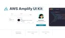
AWS Amplify
Figma Komponenten für Bau Amplify-powered apps mit consistent AWS Designsprache.
Airtable UI Kit
Figma Komponenten für gestaltend Airtable-integrated apps mit consistent UI Muster.
Backstage Design System
Figma Kit für Backstage Entwickler portals mit UI-Komponenten und guidelines.

Base Gallery
Figma Community file showcasing Sammlung von UI-Komponenten für gestalten Inspiration und Prototyping.

Atlassian Design System
umfassend guidelines und Figma Komponenten für consistent, accessible product interfaces.
Carbon Design System
IBM's öffnen Source UI-Framework für consistent, accessible enterprise products.
Cloudscape Design System
AWS öffnen Source UI-Framework für consistent, accessible enterprise Cloud applications.

Wix Design System
umfassend Figma Bibliothek von UI-Komponenten und guidelines für consistent Wix app Designs.