Ant Design
Ant 디자인하다는 enterprise-level UI デザイン言語 및 React 컴포넌트 라이브러리, 제공 고품질 UI solutions 로 도움 구축 우아한 및 효율적인 enterprise products.
제품 개요
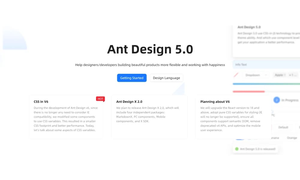
Ant Design is more than just a component library; it's a complete enterprise product design system, encompassing design principles, specifications, and a rich set of React UI components. It aims to solve design and development efficiency challenges in complex applications. Rich React UI Components Ant Design offers a very comprehensive and high-quality collection of React components, covering various aspects such as data display, data entry, feedback, navigation, and layout. These components are meticulously designed and developed to meet the demands of enterprise-level applications. Ant Design has detailed design specifications and best practices, including color, typography, layout, icons, and animations, helping designers and developers maintain visual consistency and user experience across product interfaces. Ant Design comes with built-in internationalization support, making it easy for developers to build multilingual applications for global users. It provides various language packages that can be easily switched. Theme Customization While Ant Design has its distinct design style, it also offers powerful theme customization capabilities. Users can modify less variables to customize colors, fonts, borders, and other styles to match their brand identity. Powerful Data Visualization Capabilities Although not its core, libraries within the Ant Design ecosystem like G2Plot provide robust data visualization capabilities that can be seamlessly integrated with Ant Design components to build professional charts and reports. Suitable for Various Scenarios Ant Design is widely used in various scenarios such as backend management systems, corporate websites, data visualization platforms, and any other applications requiring stable, efficient, and aesthetically pleasing interfaces. TypeScript Friendly Ant Design is entirely written in TypeScript, providing comprehensive type definitions, offering a friendly development experience for TypeScript users. Ecosystem Ant Design boasts an active community and a rich ecosystem, including Vue versions like Ant Design Vue, Angular versions like NG-ZORRO, and various tools and resources.
추천 대상
Ant 디자인하다 is entirely written 에서 TypeScript, 제공 포괄적인 type definitions, 제공 friendly development experience 를 위한 TypeScript 사용자. Ant 디자인하다 boasts active 커뮤니티 및 풍부한 에코시스템, 포함 Vue versions 같은 Ant 디자인하다 Vue, Angular versions 같은 NG-ZORRO, 및 다양한 도구 및 리소스.
주요 기능
- 포괄적인 컴포넌트 라이브러리
- 디자인 토큰
- Documentation included
- Theme 사용자 정의
장점
- +방대한 아이콘 라이브러리
- +색상 및 크기 커스터마이징 가능
- +다양한 폰트 선택
- +색상 팔레트 생성
단점
- -도입 시 팀 조율 필요
- -커스터마이징이 복잡할 수 있음

Tailwind UI Blocks
Tailwind UI Blocks offer pre-구축된 UI 컴포넌트 및 layouts 기반 에서 Tailwind CSS, accelerating 당신의 웹 development 를 위한 아름다운 및 반응형 디자인.
Nuxt UI
Nuxt UI는 오픈소스 UI 컴포넌트 라이브러리 designed 를 위한 Nuxt 3 applications, 제공 아름다운, 사용자 정의 가능, 및 accessible Vue 컴포넌트.
Vuetify
Vuetify는 완벽한 Vue.js UI 프레임워크 그 strictly adheres 로 머티리얼 디자인하다 guidelines, 제공 풍부한 세트 의 컴포넌트 및 강력한 사용자 정의 capabilities.
Element Plus
Element Plus는 데스크탑 UI 컴포넌트 라이브러리 designed 를 위한 Vue 3, 제공 풍부한, 우아한 enterprise-grade 컴포넌트 로 efficiently 구축 management systems.
MUI
MUI는 UI 컴포넌트 라이브러리 specifically designed 를 위한 React applications. 그것 제공합니다 vast array 의 ready-로-사용 React 컴포넌트 를 위한 구축 사용자 인터페이스, following React's declarative programming paradigm.
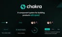
Chakra UI
Chakra UI는 심플한, modular, 및 accessible React UI 컴포넌트 라이브러리, focused 에서 enhancing 개발자 experience 및 제공 highly 사용자 정의 가능 구축 blocks.
Hero UI
아름다운, 빠른 및 모던 React UI 라이브러리 를 위한 구축 accessible 및 사용자 정의 가능 웹 applications.
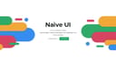
Naive UI
Naive UI는 Vue 3 컴포넌트 라이브러리 recommended 에 의한 Evan 당신, 제공 아름다운, high-performance, 및 highly 사용자 정의 가능 컴포넌트, entirely written 에서 TypeScript.