Chakra UI
Chakra UI는 심플한, modular, 및 accessible React UI 컴포넌트 라이브러리, focused 에서 enhancing 개발자 experience 및 제공 highly 사용자 정의 가능 구축 blocks.
제품 개요
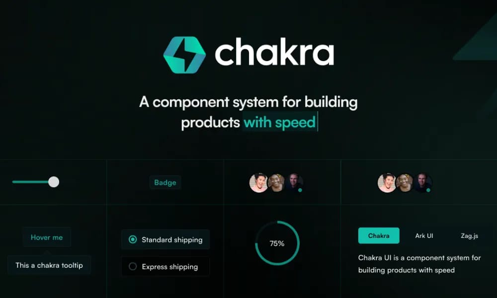
Chakra UI offers a set of simple, composable React UI components designed to help developers quickly build user interfaces. Its components are designed to be modular, easy to understand and use. Emphasizing Accessibility Chakra UI places accessibility as one of its core design principles. All components adhere to WAI-ARIA standards, with built-in keyboard navigation, focus management, and appropriate ARIA attributes, ensuring a good experience for users of assistive technologies. Highly Customizable The library provides powerful styling customization capabilities. It is based on Styled System, allowing users to pass CSS styles directly via props or configure global and local customizations through themes. Developers can easily modify component colors, spacing, fonts, sizes, etc. Out-of-the-Box Dark Mode Chakra UI comes with excellent out-of-the-box support for Dark Mode, enabling easy switching of application color themes without additional configuration, adapting to user preferences. Flexible Layout Components Chakra UI provides a range of flexible layout components, such as Box and Flex, which serve as foundational building blocks to help developers quickly construct complex layout structures. Powerful Theming Capabilities Beyond style customization, Chakra UI's theming functionality allows developers to define and extend their own design systems. Color modes, breakpoints, typography, and default component styles can all be customized. Easy to Learn and Use Chakra UI's API is intuitively designed, and its documentation is clear. Coupled with its emphasis on developer experience, it offers a gentle learning curve, allowing developers to get started quickly. Components inherently possess responsive capabilities. Users can easily define style behaviors for different screen sizes using array or object syntax in props.
추천 대상
Chakra UI's API is intuitively designed, 및 그것의 documentation is clear. Coupled 를 사용한 그것의 emphasis 에서 개발자 experience, 그것 제공합니다 gentle learning curve, allowing 개발자 로 시작하기 빠르게. 자동화된 반응형 디자인하다 컴포넌트 inherently possess 반응형 capabilities. 사용자 할 수 있다 easily define style behaviors 를 위한 다른 화면 sizes 사용 array 또는 object syntax 에서 `props`.
주요 기능
- 포괄적인 컴포넌트 라이브러리
- 디자인 토큰
- Documentation included
- Theme 사용자 정의
장점
- +다양한 폰트 선택
- +색상 팔레트 생성
- +CSS/디자인 도구로 내보내기
- +접근성 대비 검사
단점
- -도입 시 팀 조율 필요
- -커스터마이징이 복잡할 수 있음
/// 스펙
- 가격:Free

Tailwind UI Blocks
Tailwind UI Blocks offer pre-구축된 UI 컴포넌트 및 layouts 기반 에서 Tailwind CSS, accelerating 당신의 웹 development 를 위한 아름다운 및 반응형 디자인.
Nuxt UI
Nuxt UI는 오픈소스 UI 컴포넌트 라이브러리 designed 를 위한 Nuxt 3 applications, 제공 아름다운, 사용자 정의 가능, 및 accessible Vue 컴포넌트.
Vuetify
Vuetify는 완벽한 Vue.js UI 프레임워크 그 strictly adheres 로 머티리얼 디자인하다 guidelines, 제공 풍부한 세트 의 컴포넌트 및 강력한 사용자 정의 capabilities.
Element Plus
Element Plus는 데스크탑 UI 컴포넌트 라이브러리 designed 를 위한 Vue 3, 제공 풍부한, 우아한 enterprise-grade 컴포넌트 로 efficiently 구축 management systems.
MUI
MUI는 UI 컴포넌트 라이브러리 specifically designed 를 위한 React applications. 그것 제공합니다 vast array 의 ready-로-사용 React 컴포넌트 를 위한 구축 사용자 인터페이스, following React's declarative programming paradigm.
shadcn/ui
shadcn/ui는 복사하여 붙여넣을 수 있는 고도로 커스터마이징 가능한 React UI 컴포넌트 컬렉션으로, Tailwind CSS와 완벽하게 통합됩니다.
Ant Design
Ant 디자인하다는 enterprise-level UI デザイン言語 및 React 컴포넌트 라이브러리, 제공 고품질 UI solutions 로 도움 구축 우아한 및 효율적인 enterprise products.

Hero UI
아름다운, 빠른 및 모던 React UI 라이브러리 를 위한 구축 accessible 및 사용자 정의 가능 웹 applications.

Naive UI
Naive UI는 Vue 3 컴포넌트 라이브러리 recommended 에 의한 Evan 당신, 제공 아름다운, high-performance, 및 highly 사용자 정의 가능 컴포넌트, entirely written 에서 TypeScript.