MUI는 UI 컴포넌트 라이브러리 specifically designed 를 위한 React applications. 그것 제공합니다 vast array 의 ready-로-사용 React 컴포넌트 를 위한 구축 사용자 인터페이스, following React's declarative programming paradigm.
제품 개요
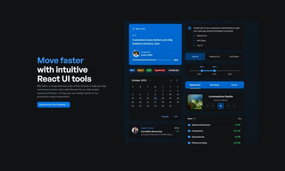
MUI is a UI component library specifically designed for React applications. It provides a vast array of ready-to-use React components for building user interfaces, following React's declarative programming paradigm. At its core, MUI adheres to Google's Material Design system. This means all components share a consistent visual style, animations, and interactive behaviors, providing users with a familiar yet modern experience. Rich Component Collection MUI offers a very comprehensive collection of components, covering almost all common UI elements in web and application development, including buttons, input fields, forms, navigation bars, cards, dialogs, data grids, menus, tooltips, icons, and more. High Customizability Despite following Material Design, MUI still offers extremely high customizability. Users can easily modify component styles such as colors, spacing, typography, shadows, etc., through its powerful theming system, the `sx` prop, or the `styled` utility, to match their brand or design requirements. Performance Optimization MUI is committed to delivering high-performance components. It employs optimization techniques, such as on-demand component loading, to ensure rapid application responsiveness. All MUI components come with built-in responsive design capabilities, automatically adapting to different screen sizes and devices, ensuring a good user experience on desktops, tablets, and mobile devices. Accessibility MUI places great emphasis on accessibility. All components are meticulously designed to follow WAI-ARIA best practices, supporting keyboard navigation, focus management, and semantic HTML structures, allowing users of assistive technologies to access applications smoothly. Professional Extension Products In addition to the core open-source component library, MUI also offers professional paid products, such as: MUI X: Includes advanced Data Grid, Date Pickers, Tree View, and other complex components, providing more powerful functionalities and performance. MUI Templates: Pre-built, out-of-the-box React templates that can accelerate project kick-off and development.
추천 대상
팀 구축 확장 가능한, consistent digital products.
주요 기능
- 포괄적인 컴포넌트 라이브러리
- 디자인 토큰
- Documentation included
- Theme 사용자 정의
장점
- +오픈 소스
- +바로 사용 가능한 템플릿
- +방대한 아이콘 라이브러리
- +색상 및 크기 커스터마이징 가능
단점
- -도입 시 팀 조율 필요
- -커스터마이징이 복잡할 수 있음
/// 스펙
- 가격:Free

Tailwind UI Blocks
Tailwind UI Blocks offer pre-구축된 UI 컴포넌트 및 layouts 기반 에서 Tailwind CSS, accelerating 당신의 웹 development 를 위한 아름다운 및 반응형 디자인.
Nuxt UI
Nuxt UI는 오픈소스 UI 컴포넌트 라이브러리 designed 를 위한 Nuxt 3 applications, 제공 아름다운, 사용자 정의 가능, 및 accessible Vue 컴포넌트.
Vuetify
Vuetify는 완벽한 Vue.js UI 프레임워크 그 strictly adheres 로 머티리얼 디자인하다 guidelines, 제공 풍부한 세트 의 컴포넌트 및 강력한 사용자 정의 capabilities.
Element Plus
Element Plus는 데스크탑 UI 컴포넌트 라이브러리 designed 를 위한 Vue 3, 제공 풍부한, 우아한 enterprise-grade 컴포넌트 로 efficiently 구축 management systems.
Ant Design
Ant 디자인하다는 enterprise-level UI デザイン言語 및 React 컴포넌트 라이브러리, 제공 고품질 UI solutions 로 도움 구축 우아한 및 효율적인 enterprise products.

Chakra UI
Chakra UI는 심플한, modular, 및 accessible React UI 컴포넌트 라이브러리, focused 에서 enhancing 개발자 experience 및 제공 highly 사용자 정의 가능 구축 blocks.

Hero UI
아름다운, 빠른 및 모던 React UI 라이브러리 를 위한 구축 accessible 및 사용자 정의 가능 웹 applications.