Primer Design System
GitHub's open-source design system for consistent, accessible web interfaces.
Product Overview
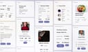
Primer is GitHub's official open-source design system, providing reusable UI components, patterns, and guidelines to build consistent, accessible, and performant web experiences across GitHub products and third-party integrations. It includes Primer React (components), Primer Primitives (low-level tokens), and Primer CSS for flexible implementation, with a focus on developer productivity, modularity, and GitHub's brand language. Component Library: Reusable elements like buttons, forms, navigation, avatars, and markdown with variants for themes and states. Design Tokens: Semantic colors, typography, spacing, motion, and icons for unified styling. Accessibility: WCAG compliance with ARIA support and inclusive patterns. Tools: Figma kit for prototyping; React and CSS libraries for implementation; Storybook for exploration.
label.best_for
Teams building scalable, consistent digital products.
Key Features
- Component Library: Reusable elements like buttons, forms, navigation, avatars, and markdown with variants for themes and states.
- Design Tokens: Semantic colors, typography, spacing, motion, and icons for unified styling.
- Accessibility: WCAG compliance with ARIA support and inclusive patterns.
- Tools: Figma kit for prototyping; React and CSS libraries for implementation; Storybook for exploration.
Pros
- +Open source
- +Extensive icon library
- +Color palette generation
- +Export to CSS/design tools
Cons
- -Adoption requires team alignment
- -Customization can be complex
/// SPECS
- Pricing:free
- Platform:Browser
Vuetify
Vuetify is a complete Vue.js UI framework that strictly adheres to Material Design guidelines, offering a rich set of components and powerful customization capabilities.
A2UI
open-source protocol for AI agents to generate secure, declarative UIs across platforms.

Watt Design System
Holaluz's Figma-based UI kit for consistent, accessible renewable energy interfaces.