Backstage Design System
Figma kit for Backstage developer portals with UI components and guidelines.
Product Overview
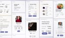
The Backstage Design System is a community Figma file providing a comprehensive design system for Backstage, Spotify's open-source developer portal framework. Created by the Backstage team, it includes reusable UI components, patterns, and guidelines to ensure consistent, scalable interfaces for software catalogs, tech docs, and plugins. With thousands of views, it's ideal for developers and designers building internal tools, focusing on modularity, accessibility, and CNCF-aligned standards. Component Library: Elements like cards, tables, navigation, buttons, and charts with variants for themes and states. Design Tokens: Colors, typography, spacing, and icons based on Backstage's principles. Prototyping Support: Auto-layout and interactions for rapid portal prototyping. Guidelines: Best practices for developer experience and integration.
label.best_for
Design Tokens: Colors, typography, spacing, and icons based on Backstage's principles. Prototyping Support: Auto-layout and interactions for rapid portal prototyping. Guidelines: Best practices for developer experience and integration.
Key Features
- Component Library: Elements like cards, tables, navigation, buttons, and charts with variants for themes and states.
- Design Tokens: Colors, typography, spacing, and icons based on Backstage's principles.
- Prototyping Support: Auto-layout and interactions for rapid portal prototyping.
- Guidelines: Best practices for developer experience and integration.
Pros
- +Open source
- +Real-time collaboration
- +Extensive icon library
- +Color palette generation
Cons
- -Adoption requires team alignment
- -Customization can be complex
/// SPECS
- Pricing:free
- Platform:Browser
Vuetify
Vuetify is a complete Vue.js UI framework that strictly adheres to Material Design guidelines, offering a rich set of components and powerful customization capabilities.
A2UI
open-source protocol for AI agents to generate secure, declarative UIs across platforms.

Watt Design System
Holaluz's Figma-based UI kit for consistent, accessible renewable energy interfaces.