AWS Amplify
Figma components for building Amplify-powered apps with consistent AWS design language.
Product Overview
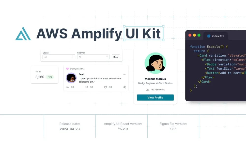
is an official Figma community file from AWS, providing a comprehensive library of UI components tailored for AWS Amplify-powered applications. It enables designers and developers to create consistent, accessible interfaces aligned with AWS's design system, including buttons, forms, navigation, data displays, and responsive elements. With over 10k views and 200+ likes, it's ideal for prototyping Amplify-based web and mobile apps, ensuring scalability and brand alignment. Component Library: Pre-built elements like buttons, inputs, modals, tables, and charts with variants for states and themes. Design Tokens: Colors, typography, spacing, and icons based on AWS Polaris guidelines. Prototyping Support: Auto-layout and interactions for rapid wireframing and handoff to code. Accessibility: Built-in ARIA labels and semantic components for inclusive design.
label.best_for
Design Tokens: Colors, typography, spacing, and icons based on AWS Polaris guidelines. Prototyping Support: Auto-layout and interactions for rapid wireframing and handoff to code. Accessibility: Built-in ARIA labels and semantic components for inclusive design.
Key Features
- Component Library: Pre-built elements like buttons, inputs, modals, tables, and charts with variants for states and themes.
- Design Tokens: Colors, typography, spacing, and icons based on AWS Polaris guidelines.
- Prototyping Support: Auto-layout and interactions for rapid wireframing and handoff to code.
- Accessibility: Built-in ARIA labels and semantic components for inclusive design.
Pros
- +Extensive icon library
- +Color palette generation
- +Accessibility contrast checking
- +Comprehensive design system
Cons
- -Adoption requires team alignment
- -Customization can be complex
/// SPECS
- Pricing:free
- Platform:Browser

Vuetify
Vuetify is a complete Vue.js UI framework that strictly adheres to Material Design guidelines, offering a rich set of components and powerful customization capabilities.

A2UI
open-source protocol for AI agents to generate secure, declarative UIs across platforms.

Watt Design System
Holaluz's Figma-based UI kit for consistent, accessible renewable energy interfaces.