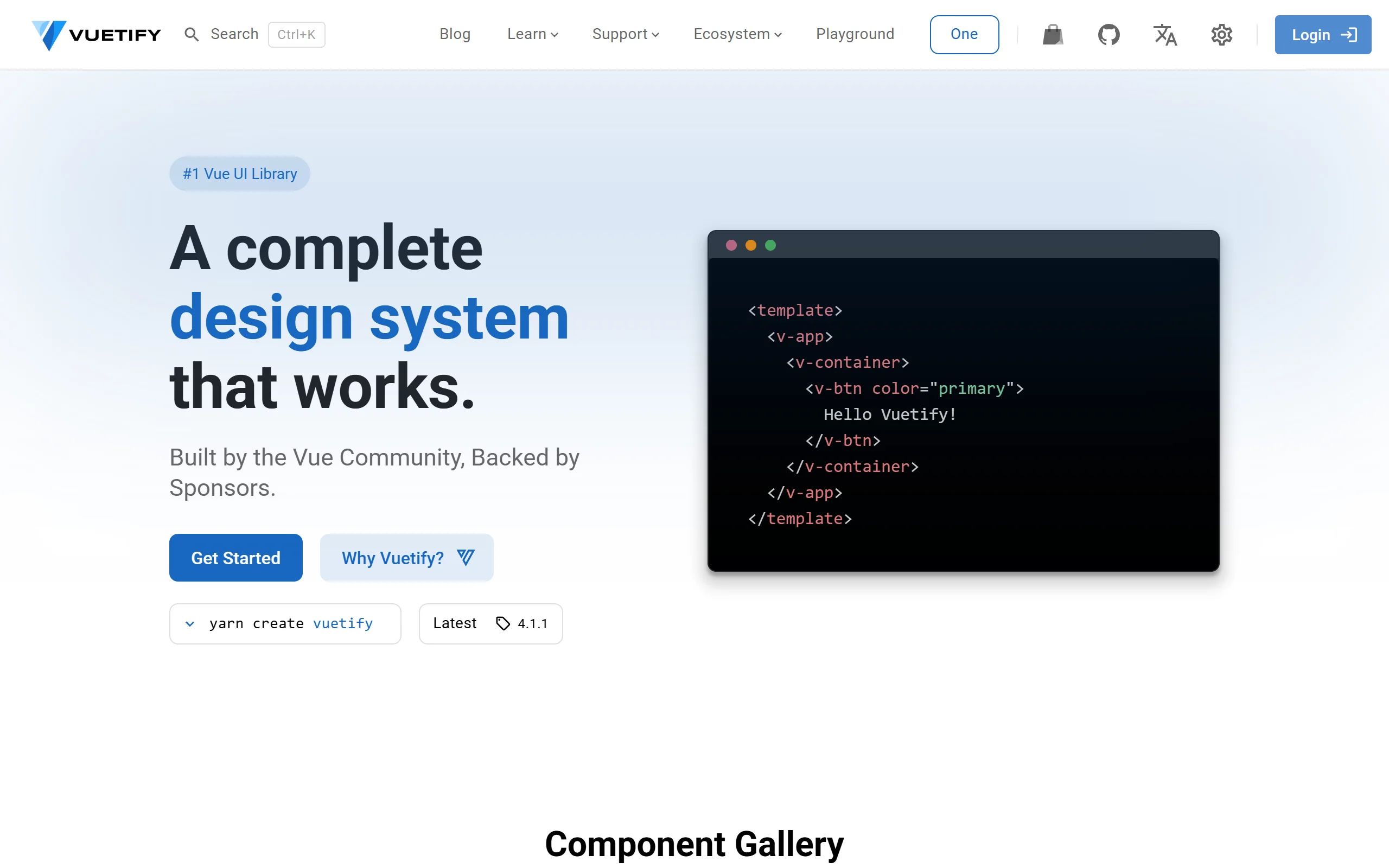
Vuetify is a complete Vue.js UI framework that strictly adheres to Material Design guidelines, offering a rich set of components and powerful customization capabilities.
Product Overview
Vuetify is a comprehensive UI framework designed for the Vue.js ecosystem. It is more than just a component library; it's a solution that integrates a design system, tools, and resources to help developers build complete applications. A core feature of Vuetify is its strict adherence to Google's Material Design guidelines. All components are highly compliant with Material Design specifications in terms of appearance, interaction, and animation, providing a consistent and modern user experience. Rich UI Components The framework offers over 80 high-quality UI components, covering everything from basic buttons, cards, input fields to complex layout systems, data tables, navigation drawers, dialogs, time pickers, and more, capable of meeting the needs of various complex applications.
Best For
A core feature of Vuetify is its strict adherence to Google's Material Design guidelines. All components are highly compliant with Material Design specifications in terms of appearance, interaction, and animation, providing a consistent and modern user experience. The framework offers over 80 high-quality UI components, covering everything from basic buttons, cards, input fields to complex layout systems, data tables, navigation drawers, dialogs, time pickers, and more, capable of meeting the needs of various complex applications.
Key Features
- Comprehensive component library
- Design tokens
- Documentation included
- Theme customization
Pros
- +Smooth animation capabilities
- +Comprehensive design system
- +Frontend-ready components
- +Developer-friendly
Cons
- -Adoption requires team alignment
- -Customization can be complex
/// SPECS
- Pricing:Free
shadcn/ui
shadcn/ui is a unique collection of composable React UI components, offering copy-and-paste code that is highly customizable and seamlessly integrates with Tailwind CSS.

MUI
MUI is a UI component library specifically designed for React applications. It provides a vast array of ready-to-use React components for building user interfaces, following React's declarative programming paradigm.
Animate UI
Animate UI is a free open-source React component library with Tailwind and Framer Motion animations, inspired by shadcn/ui, to effortlessly elevate web interfaces.
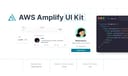
AWS Amplify
Figma components for building Amplify-powered apps with consistent AWS design language.

Flowbite Design System
open-source Tailwind CSS component library with Figma kit for rapid UI building.
Ant Design
Ant Design is an enterprise-level UI design language and React component library, providing high-quality UI solutions to help build elegant and efficient enterprise products.

Chakra UI
Chakra UI is a simple, modular, and accessible React UI component library, focused on enhancing developer experience and providing highly customizable building blocks.

Hero UI
Beautiful, fast and modern React UI library for building accessible and customizable web applications.
Naive UI
Naive UI is a Vue 3 component library recommended by Evan You, offering beautiful, high-performance, and highly customizable components, entirely written in TypeScript.

Wix Design System
comprehensive Figma library of UI components and guidelines for consistent Wix app designs.
Element Plus
Element Plus is a desktop UI component library designed for Vue 3, offering rich, elegant enterprise-grade components to efficiently build management systems.