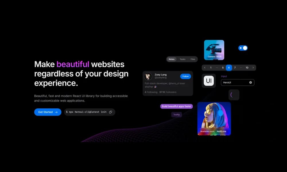
Beautiful, fast and modern React UI library for building accessible and customizable web applications.
Product Overview
HeroUI offers a variety of UI blocks, components, and templates built with Tailwind CSS, aiming to accelerate web development, especially for projects utilizing Tailwind CSS.
Best For
Teams building scalable, consistent digital products.
Key Features
- Comprehensive component library
- Design tokens
- Documentation included
- Theme customization
Pros
- +Ready-to-use templates
- +Comprehensive design system
- +Streamlines workflow
Cons
- -Adoption requires team alignment
- -Customization can be complex
/// SPECS
- Pricing:Free

Tailwind UI Blocks
Tailwind UI Blocks offer pre-built UI components and layouts based on Tailwind CSS, accelerating your web development for beautiful and responsive designs.

Nuxt UI
Nuxt UI is an open-source UI component library designed for Nuxt 3 applications, offering beautiful, customizable, and accessible Vue components.

Vuetify
Vuetify is a complete Vue.js UI framework that strictly adheres to Material Design guidelines, offering a rich set of components and powerful customization capabilities.
shadcn/ui
shadcn/ui is a unique collection of composable React UI components, offering copy-and-paste code that is highly customizable and seamlessly integrates with Tailwind CSS.

MUI
MUI is a UI component library specifically designed for React applications. It provides a vast array of ready-to-use React components for building user interfaces, following React's declarative programming paradigm.

Animate UI
Animate UI is a free open-source React component library with Tailwind and Framer Motion animations, inspired by shadcn/ui, to effortlessly elevate web interfaces.

Flowbite Design System
open-source Tailwind CSS component library with Figma kit for rapid UI building.

Ant Design
Ant Design is an enterprise-level UI design language and React component library, providing high-quality UI solutions to help build elegant and efficient enterprise products.

Chakra UI
Chakra UI is a simple, modular, and accessible React UI component library, focused on enhancing developer experience and providing highly customizable building blocks.

Naive UI
Naive UI is a Vue 3 component library recommended by Evan You, offering beautiful, high-performance, and highly customizable components, entirely written in TypeScript.
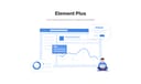
Element Plus
Element Plus is a desktop UI component library designed for Vue 3, offering rich, elegant enterprise-grade components to efficiently build management systems.