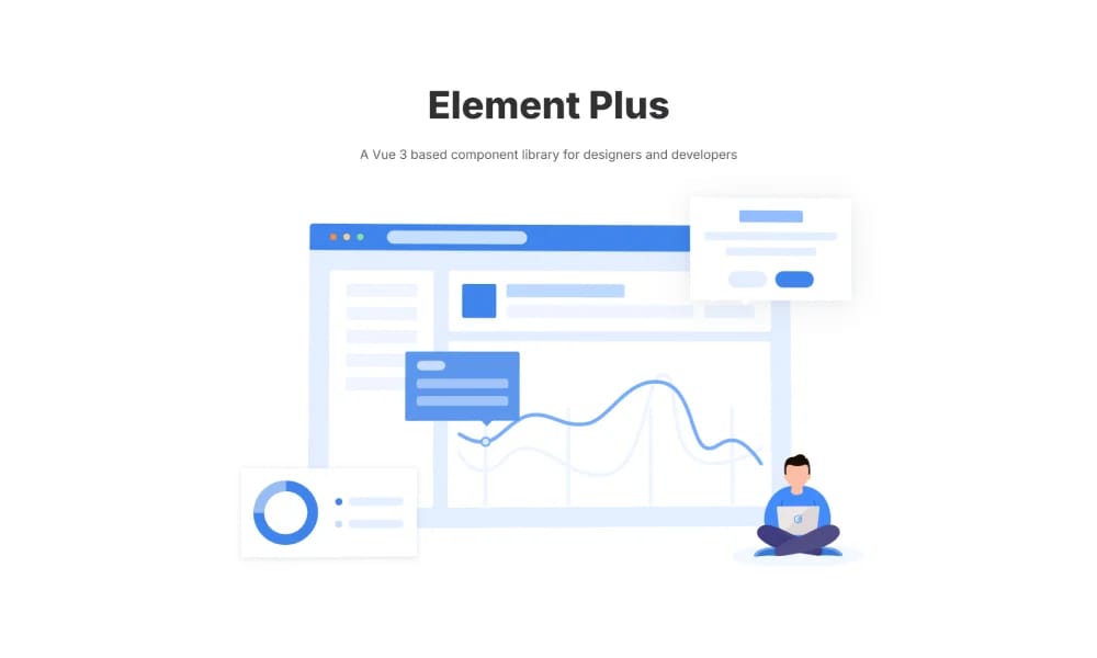
Element Plus
Element Plus is a desktop UI component library designed for Vue 3, offering rich, elegant enterprise-grade components to efficiently build management systems.
Product Overview
Element Plus is a set of desktop UI components tailor-made by the Ele.me front-end team for the Vue 3 ecosystem. It fully leverages the new features of Vue 3, providing components that seamlessly integrate with Vue 3 applications. Rich Enterprise-Grade UI Components The library offers a very comprehensive and high-quality set of UI components, covering a wide range from basic elements (like buttons, icons, layouts) to complex components (like data tables, forms, date pickers, notifications, modals, tree controls, uploads), sufficient to meet the development needs of enterprise-level backend management systems. Element Plus adheres to its unique design language, ensuring all components maintain high consistency in visual style and interactive behavior, providing users with a unified and professional experience. Element Plus comes with built-in internationalization support for multiple languages, allowing developers to easily translate applications into different languages to serve a global user base. Theme Customization Capability The library provides powerful theme customization capabilities. Users can customize component styles such as colors, fonts, borders, spacing, etc., by modifying SCSS variables, to match their brand or project style. Accessibility Element Plus emphasizes accessibility design, striving to make components accessible to all users, including those using assistive technologies. Components aim to comply with WAI-ARIA specifications. Complete Development Documentation and Examples Element Plus boasts very comprehensive and clear official documentation. Each component provides detailed API descriptions, usage examples, and code demos, greatly facilitating developers' learning and use. TypeScript Friendly Element Plus is entirely written in TypeScript, offering complete type definitions, providing a good development experience and code hints for TypeScript users.
Best For
Element Plus boasts very comprehensive and clear official documentation. Each component provides detailed API descriptions, usage examples, and code demos, greatly facilitating developers' learning and use. Element Plus is entirely written in TypeScript, offering complete type definitions, providing a good development experience and code hints for TypeScript users.
Key Features
- Comprehensive component library
- Design tokens
- Documentation included
- Theme customization
Pros
- +Real-time collaboration
- +Extensive icon library
- +Customizable colors and sizes
- +Wide font selection
Cons
- -Adoption requires team alignment
- -Customization can be complex
/// SPECS
- Pricing:Free

Nuxt UI
Nuxt UI is an open-source UI component library designed for Nuxt 3 applications, offering beautiful, customizable, and accessible Vue components.
Vuetify
Vuetify is a complete Vue.js UI framework that strictly adheres to Material Design guidelines, offering a rich set of components and powerful customization capabilities.
shadcn/ui
shadcn/ui is a unique collection of composable React UI components, offering copy-and-paste code that is highly customizable and seamlessly integrates with Tailwind CSS.

MUI
MUI is a UI component library specifically designed for React applications. It provides a vast array of ready-to-use React components for building user interfaces, following React's declarative programming paradigm.
Animate UI
Animate UI is a free open-source React component library with Tailwind and Framer Motion animations, inspired by shadcn/ui, to effortlessly elevate web interfaces.

Flowbite Design System
open-source Tailwind CSS component library with Figma kit for rapid UI building.

Ant Design
Ant Design is an enterprise-level UI design language and React component library, providing high-quality UI solutions to help build elegant and efficient enterprise products.

Chakra UI
Chakra UI is a simple, modular, and accessible React UI component library, focused on enhancing developer experience and providing highly customizable building blocks.

Hero UI
Beautiful, fast and modern React UI library for building accessible and customizable web applications.

Naive UI
Naive UI is a Vue 3 component library recommended by Evan You, offering beautiful, high-performance, and highly customizable components, entirely written in TypeScript.

Wix Design System
comprehensive Figma library of UI components and guidelines for consistent Wix app designs.