MUI is a UI component library specifically designed for React applications. It provides a vast array of ready-to-use React components for building user interfaces, following React's declarative programming paradigm.
Product Overview
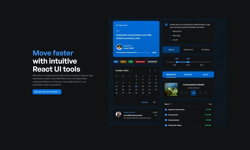
MUI is a UI component library specifically designed for React applications. It provides a vast array of ready-to-use React components for building user interfaces, following React's declarative programming paradigm. At its core, MUI adheres to Google's Material Design system. This means all components share a consistent visual style, animations, and interactive behaviors, providing users with a familiar yet modern experience. Rich Component Collection MUI offers a very comprehensive collection of components, covering almost all common UI elements in web and application development, including buttons, input fields, forms, navigation bars, cards, dialogs, data grids, menus, tooltips, icons, and more. High Customizability Despite following Material Design, MUI still offers extremely high customizability. Users can easily modify component styles such as colors, spacing, typography, shadows, etc., through its powerful theming system, the `sx` prop, or the `styled` utility, to match their brand or design requirements. Performance Optimization MUI is committed to delivering high-performance components. It employs optimization techniques, such as on-demand component loading, to ensure rapid application responsiveness. All MUI components come with built-in responsive design capabilities, automatically adapting to different screen sizes and devices, ensuring a good user experience on desktops, tablets, and mobile devices. Accessibility MUI places great emphasis on accessibility. All components are meticulously designed to follow WAI-ARIA best practices, supporting keyboard navigation, focus management, and semantic HTML structures, allowing users of assistive technologies to access applications smoothly. Professional Extension Products In addition to the core open-source component library, MUI also offers professional paid products, such as: MUI X: Includes advanced Data Grid, Date Pickers, Tree View, and other complex components, providing more powerful functionalities and performance. MUI Templates: Pre-built, out-of-the-box React templates that can accelerate project kick-off and development.
Best For
Teams building scalable, consistent digital products.
Key Features
- Comprehensive component library
- Design tokens
- Documentation included
- Theme customization
Pros
- +Open source
- +Ready-to-use templates
- +Extensive icon library
- +Customizable colors and sizes
Cons
- -Adoption requires team alignment
- -Customization can be complex
/// SPECS
- Pricing:Free

Tailwind UI Blocks
Tailwind UI Blocks offer pre-built UI components and layouts based on Tailwind CSS, accelerating your web development for beautiful and responsive designs.
Nuxt UI
Nuxt UI is an open-source UI component library designed for Nuxt 3 applications, offering beautiful, customizable, and accessible Vue components.
Vuetify
Vuetify is a complete Vue.js UI framework that strictly adheres to Material Design guidelines, offering a rich set of components and powerful customization capabilities.
Ant Design
Ant Design is an enterprise-level UI design language and React component library, providing high-quality UI solutions to help build elegant and efficient enterprise products.

Chakra UI
Chakra UI is a simple, modular, and accessible React UI component library, focused on enhancing developer experience and providing highly customizable building blocks.

Hero UI
Beautiful, fast and modern React UI library for building accessible and customizable web applications.
Element Plus
Element Plus is a desktop UI component library designed for Vue 3, offering rich, elegant enterprise-grade components to efficiently build management systems.